.jpg.png)
Exploring the New Invoice Format in QuickBooks Online
You may have noticed that the invoice format in your QuickBooks Online has changed!
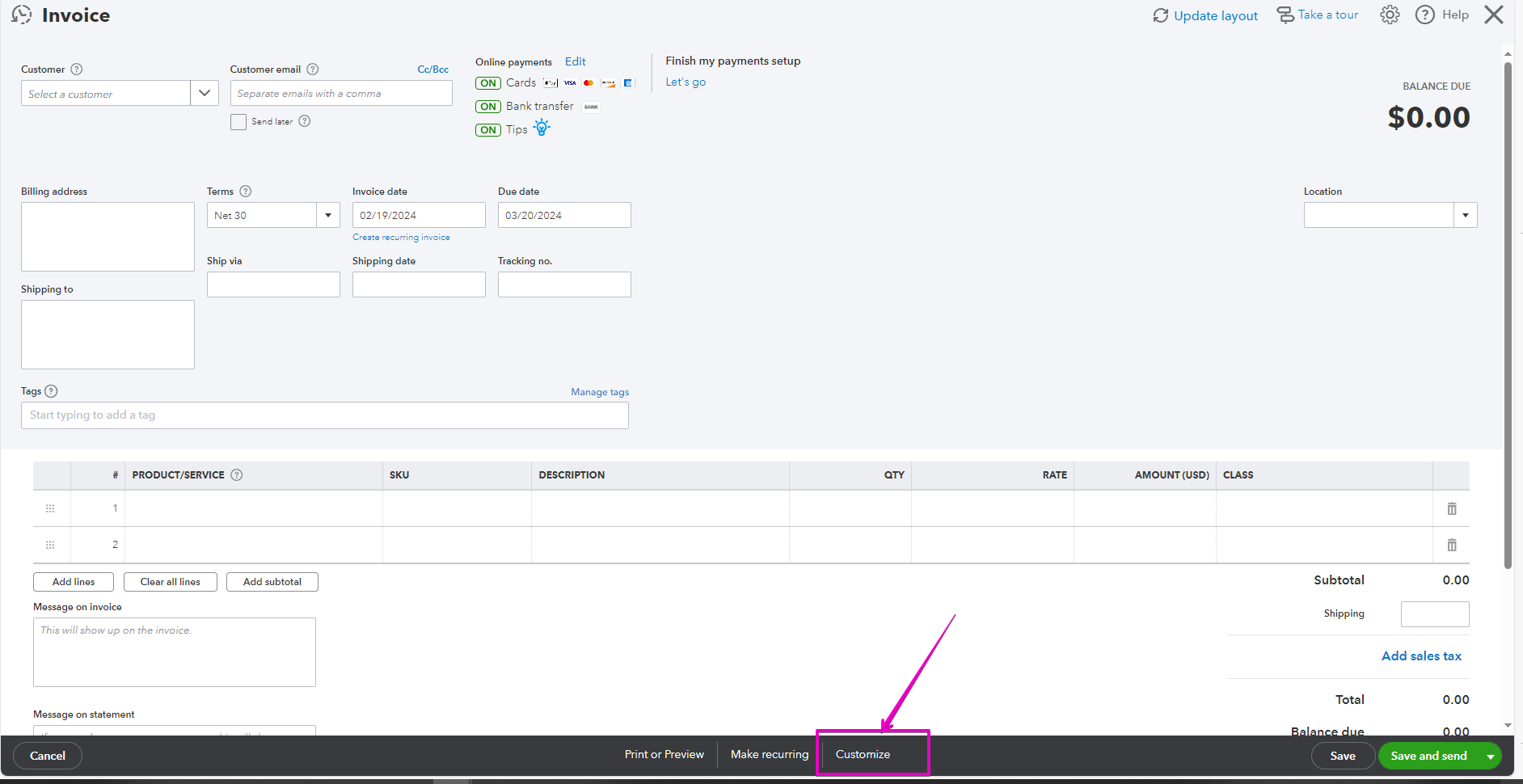
Previously if you opened your invoice it looked like this:

If you wanted to make changes you selected customize at the bottom.
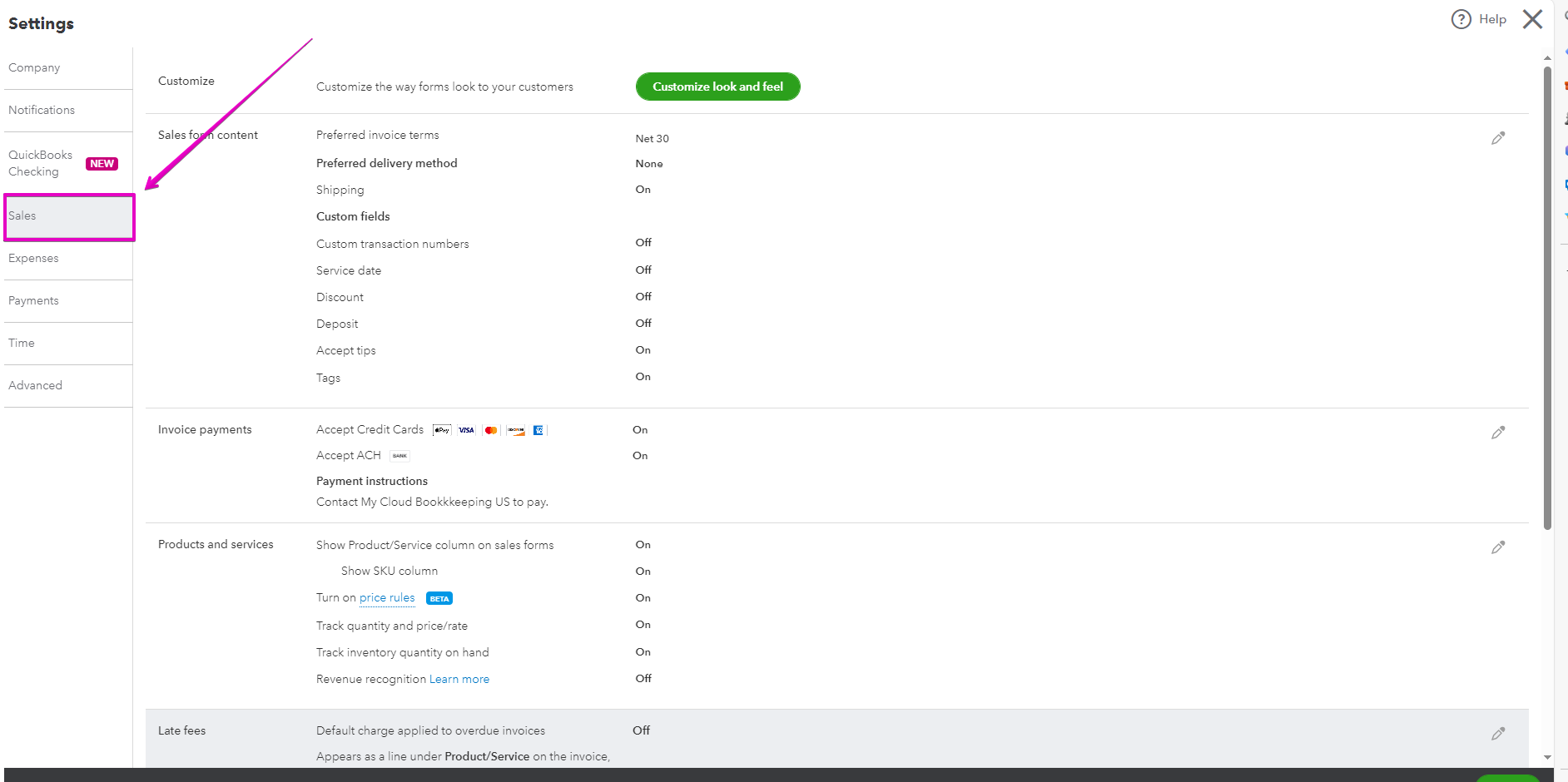
For more advanced changes you opened your gear icon on the top right. And there were a myriad of options available to you.

In an effort to streamline this experienceyou can now do most of these modifications directly from the invoice.
New Layout, New Experience:
.png)
The updated version now offers a more intuitive interface, making it easier to customize invoices on the go. No more back and forth - simply click on "update layout" at the top to see the changes take effect instantly.
Effortless Customization:
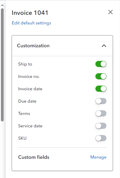
Say goodbye to the days of opening multiple tabs to edit company information or customer details. With the new layout, you can make changes to logos, company info, customer details, and more, all within the same screen. Customization options allow you to tailor each invoice to your specific needs, from selecting what to display on the invoice to setting up payment options and automation.

And here's you customization options:

Enhanced User Experience:
The new invoice format also introduces features like customer reports, invoice reminders, and easy item insertion. You can now track customer transactions, manage open invoices, and customize the email and PDF templates directly from the invoice screen. The streamlined design and options make creating and sending invoices a seamless process.
Review and Send with Ease:
One of the standout features of the updated invoice format is the "review and send" option. Preview the email and PDF attachments before sending them out, make any last-minute changes, and hit "save and send" to dispatch the invoice hassle-free. It's all about convenience and efficiency to help you stay on top of your invoicing game.
Transitioning to the New Format:
While you still have the option to switch back to the old format for a limited time, the new intuitive invoice format is designed to enhance your invoicing experience. Embrace the change, explore the enhanced functionalities, and streamline your invoicing process for improved efficiency.
The recent update to the QuickBooks Online invoice feature brings a fresh and user-friendly interface that simplifies the invoicing process. Take advantage of the new layout, customization options, and enhanced user experience to streamline your invoicing tasks and stay on top of your finances.
I would love to hear what you think. Is this a change we like?
If not, for a limited time you can still change back to the old format – there will come a time, when that option is no longer available.
If you haven’t already, grab my month-end checklist below, it will help you keep on track throughout the year, and show you what report you can run to see who has paid you, it’s important to keep up those collections for your cash flow.
Cheers!
Still need help?
Check this out.
Download our free resources today!
Valuable free resources for QuickBooks, bookkeeping, small business advice, and more.
Let's go!Still need help?
Book a session! We can work together to solve your specific QuickBooks Online questions.
Let's go!Optimizing Your Invoicing Process with QuickBooks Online Updates Video
[00:00:00] Hi, Kerry here from My Cloud Bookkeeping. Today, I'm walking through a recent change to your QuickBooks Online invoice feature. The invoice function has been updated to be a lot more intuitive and to enable you to make changes without having to jump in and out of different screens. Now this is a change I like.
Let's have a look at the new functionality in the sample company. So let's pop up to the top left to new and choose invoice. So this is the old layout. Um, the other way, of course, to get in is to go to sales. and invoices. I find a lot of more clients go this route and you click create invoice. So for the new version, we want to pop up to the top here and click update layout.
And yes, we're going to update the layout and it won't be long and you won't have the option to change back and forth. It, when you open, it's just going to permanently be exactly what you see here right now. [00:01:00] And as you can see, it looks very different. You can make changes to the logo and the company information right here without having to open up another screen.
You can click edit company right here. You may want to change something just for one of your customers. Perhaps put a different phone number or a different email address on this particular invoice without changing your company information overall. When you select your customer, you then have options to also edit the customer right here in this page without having to previously had to go right out, of course, and log into the customer section.
So if for some reason you want to update an address or here we go, change your shipping address or billing address, you can do it right here. Now under customization on the right hand side, you can select what will show up in the invoice. You can also choose payment options, mess around with design, and some [00:02:00] automation.
So let's, let's take a look at customization first. By toggling these on and off, you can select what you want to have show up on the invoice. Right here, right live, as you prepare your invoice.
Now for payment options, there won't be a lot going on in here, of course, because it's a sample company. But we can enter a deposit, Um, we can enter a shipping fee, but this would be a deposit previously paid. Be a little careful with this. I do have another video on it. You could end up with things going where you don't think they should be.
Great place to add shipping. And then we can have a look at the automation. Now this is where you can turn on and off invoice reminders. So invoice reminders themselves are still set up in the, uh, overriding sales section under the gear icon at the top. But the beauty of this is you can choose. If you want this [00:03:00] customer to receive any of the invoice reminders or all of the invoice reminders, or even none of the invoice reminders, but here you can toggle it directly specific for this invoice before you send it to your customer.
Customer reports is a really cool feature. You're able to see, um, other invoices from this same customer, checkout, transactions, and of course open invoices are the ones they haven't paid yet. So you might want to see that before you send it off, and that might also impact how many reminders you want to send out.
We're not going to do that now because it takes us right out of the invoice field, but it is great that it's there. Any changes that we make here will only impact this invoice. You would, if you wanted to make overall changes, you would still need to go up to the gear icon to that old sales section. So when you're happy with your invoice, there's some great options here on the top left.
What's going on here? Oh, okay. So let's put some [00:04:00] items in our invoice. I'm going to sell them a fountain. Okay. Add some shipping.
And then we can have a look at some of these great new few options up on the top left. So this is what the email will look like. This is what the PDF that's attached to the email will look like. And then we're, and here we can mess around with the design as well. So we can change colors. We can change fonts.
It's beautiful to be able to do this right on the invoice while we're looking at it without having to get right out into another whole customization. And then here's what they will see when they, this is when they've paid, yeah, no, this is before the pay. This is what they see when they're going to pay, which is something I usually don't get to see.
And we can, yeah. Click right here. Another thing I like is review and send rather than just save and send. We have a quick look here. There's the email which you can edit. There's [00:05:00] the PDF they're going to receive. You can change around whatever you want to write there. You could even add another email address if you hadn't done that on the prior page.
And bang, save and send. Off to Diego. So overall, the functionality hasn't changed. All that's changed is the interface. It's now much easier to adjust things while you're preparing an invoice without having to leave the invoice open other pages and then return back to the invoice. So I'd love to hear what you think.
Is this the change we like? If not, for a limited time, you can still change back to the old format, but there'll come a time when that option is no longer available. And if you haven't already, grab my month end checklist below. It'll help you keep on track throughout the year and show you what report you can run to see who's paid you.
It's important to keep up with those collections for your cash flow. Now, let me know if there are any other videos you'd like to see. Click like, subscribe, and I'll see you again soon. [00:06:00] Cheers.
Optimizing Your Invoicing Process with QuickBooks Online Updates Video
[00:00:00] Hi, Kerry here from My Cloud Bookkeeping. Today, I'm walking through a recent change to your QuickBooks Online invoice feature. The invoice function has been updated to be a lot more intuitive and to enable you to make changes without having to jump in and out of different screens. Now this is a change I like.
Let's have a look at the new functionality in the sample company. So let's pop up to the top left to new and choose invoice. So this is the old layout. Um, the other way, of course, to get in is to go to sales. and invoices. I find a lot of more clients go this route and you click create invoice. So for the new version, we want to pop up to the top here and click update layout.
And yes, we're going to update the layout and it won't be long and you won't have the option to change back and forth. It, when you open, it's just going to permanently be exactly what you see here right now. [00:01:00] And as you can see, it looks very different. You can make changes to the logo and the company information right here without having to open up another screen.
You can click edit company right here. You may want to change something just for one of your customers. Perhaps put a different phone number or a different email address on this particular invoice without changing your company information overall. When you select your customer, you then have options to also edit the customer right here in this page without having to previously had to go right out, of course, and log into the customer section.
So if for some reason you want to update an address or here we go, change your shipping address or billing address, you can do it right here. Now under customization on the right hand side, you can select what will show up in the invoice. You can also choose payment options, mess around with design, and some [00:02:00] automation.
So let's, let's take a look at customization first. By toggling these on and off, you can select what you want to have show up on the invoice. Right here, right live, as you prepare your invoice.
Now for payment options, there won't be a lot going on in here, of course, because it's a sample company. But we can enter a deposit, Um, we can enter a shipping fee, but this would be a deposit previously paid. Be a little careful with this. I do have another video on it. You could end up with things going where you don't think they should be.
Great place to add shipping. And then we can have a look at the automation. Now this is where you can turn on and off invoice reminders. So invoice reminders themselves are still set up in the, uh, overriding sales section under the gear icon at the top. But the beauty of this is you can choose. If you want this [00:03:00] customer to receive any of the invoice reminders or all of the invoice reminders, or even none of the invoice reminders, but here you can toggle it directly specific for this invoice before you send it to your customer.
Customer reports is a really cool feature. You're able to see, um, other invoices from this same customer, checkout, transactions, and of course open invoices are the ones they haven't paid yet. So you might want to see that before you send it off, and that might also impact how many reminders you want to send out.
We're not going to do that now because it takes us right out of the invoice field, but it is great that it's there. Any changes that we make here will only impact this invoice. You would, if you wanted to make overall changes, you would still need to go up to the gear icon to that old sales section. So when you're happy with your invoice, there's some great options here on the top left.
What's going on here? Oh, okay. So let's put some [00:04:00] items in our invoice. I'm going to sell them a fountain. Okay. Add some shipping.
And then we can have a look at some of these great new few options up on the top left. So this is what the email will look like. This is what the PDF that's attached to the email will look like. And then we're, and here we can mess around with the design as well. So we can change colors. We can change fonts.
It's beautiful to be able to do this right on the invoice while we're looking at it without having to get right out into another whole customization. And then here's what they will see when they, this is when they've paid, yeah, no, this is before the pay. This is what they see when they're going to pay, which is something I usually don't get to see.
And we can, yeah. Click right here. Another thing I like is review and send rather than just save and send. We have a quick look here. There's the email which you can edit. There's [00:05:00] the PDF they're going to receive. You can change around whatever you want to write there. You could even add another email address if you hadn't done that on the prior page.
And bang, save and send. Off to Diego. So overall, the functionality hasn't changed. All that's changed is the interface. It's now much easier to adjust things while you're preparing an invoice without having to leave the invoice open other pages and then return back to the invoice. So I'd love to hear what you think.
Is this the change we like? If not, for a limited time, you can still change back to the old format, but there'll come a time when that option is no longer available. And if you haven't already, grab my month end checklist below. It'll help you keep on track throughout the year and show you what report you can run to see who's paid you.
It's important to keep up with those collections for your cash flow. Now, let me know if there are any other videos you'd like to see. Click like, subscribe, and I'll see you again soon. [00:06:00] Cheers.
Still need help?
Check this out.
Download our free resources today!
Valuable free resources for QuickBooks, bookkeeping, small business advice, and more.
Let's go!Still need help?
We have what you need. Check out our courses and free resources to get more help managing your finances.
Let's go!.png)