How to Change the View of your QuickBooks Online Banking Transactions
Have you noticed the Bank Feed in QuickBooks Online has changed? Or doesn’t look like those in help videos? Or you just don’t really know what is going on?
There is a way to change your bank feed view to the alternate view – whichever one you prefer!
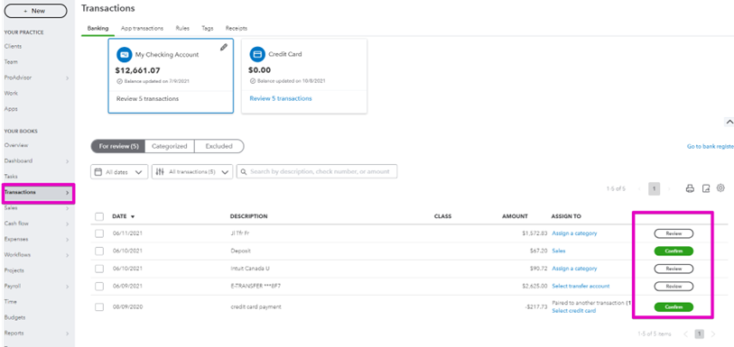
This is the version I am seeing most often when I work with business owners:

Personally, I find it confusing, and quite often very cluttered.
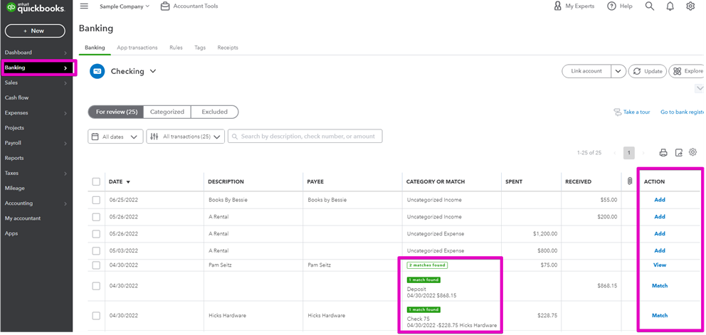
This is the version I prefer to work with:

I can clearly see what needs to be done for each row, and understand how to do it.
Now here’s the great news – you can select either view!
The first one is called the Business View, and the second the Accountant View – no wonder I prefer it!

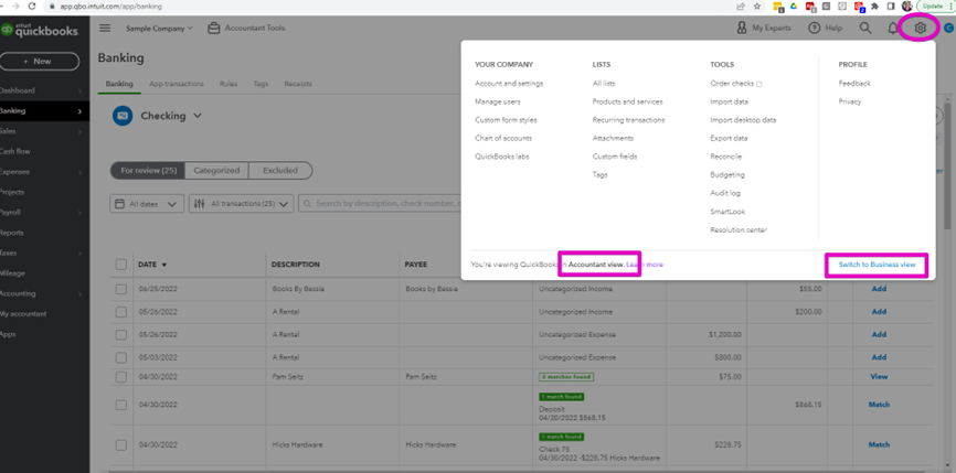
From the gear icon on the very top right you can select either view, and see which is best for you!
If you are new to QuickBooks Online, or are not sure how to most effectively work with the bank feed check out my Bank Feed Training course.
— Matching Deposits on the Bank Feed Checklist
— Other Resources
Still need help?
Check this out.
Change the view of your QuickBooks Online Banking Transactions
There is a way to change your bank feed view to the alternate view – whichever one you prefer!
Let's go!Still need help?
Book a session! We can work together to solve your specific QuickBooks Online questions.
Let's go!Video transcript:
Hi, Kerry here from My Cloud Bookkeeping. This is another video on how hopefully you can make the bank feed work a little better for you. You've heard me talk before about this “confirm” and “review”, the new view that QuickBooks Online has given you compared to the old “match” and “add”, which I find simpler. And I found a way that you can change it back if you don't like the way it is. So let's have a look.
So here we are on the bank feed for the checking account, and this is so simple to change. We pop up here to the gear icon on the top right, and we select which accountant view. Now, here we have that old view that you would've seen anytime you watched any of my other videos. I just find this so much easier and cleaner to work with; it's much clearer what we're trying to match to here. We know that we need to change this category before we add it otherwise it'll be going to an uncategorized expense. We can see here clearly that this credit card payment has been matched to another transaction. For me, this is a cleaner view to work with. Now, if you change this and you look at it and you think, well, actually I prefer that other view. It's quite simple, just pop back up here to your gear icon again, and switch back to the business view. And here you can see all of these same transactions just with this different languaging that I just find more cluttered as I've mentioned before.
So, hopefully that will help you to reduce the number of errors you have when you're working with the bank feed. If you do have any questions around the bankfeed, I have a whole pile of other videos. Check out the playlists. There are also some courses; I have one to show you how to use the bank feed properly and another one to help you clean things up if you've made a mess. And reach out, I'm always happy to help you. Thanks so much.
Cheers.
Video transcript:
Hi, Kerry here from My Cloud Bookkeeping. This is another video on how hopefully you can make the bank feed work a little better for you. You've heard me talk before about this “confirm” and “review”, the new view that QuickBooks Online has given you compared to the old “match” and “add”, which I find simpler. And I found a way that you can change it back if you don't like the way it is. So let's have a look.
So here we are on the bank feed for the checking account, and this is so simple to change. We pop up here to the gear icon on the top right, and we select which accountant view. Now, here we have that old view that you would've seen anytime you watched any of my other videos. I just find this so much easier and cleaner to work with; it's much clearer what we're trying to match to here. We know that we need to change this category before we add it otherwise it'll be going to an uncategorized expense. We can see here clearly that this credit card payment has been matched to another transaction. For me, this is a cleaner view to work with. Now, if you change this and you look at it and you think, well, actually I prefer that other view. It's quite simple, just pop back up here to your gear icon again, and switch back to the business view. And here you can see all of these same transactions just with this different languaging that I just find more cluttered as I've mentioned before.
So, hopefully that will help you to reduce the number of errors you have when you're working with the bank feed. If you do have any questions around the bankfeed, I have a whole pile of other videos. Check out the playlists. There are also some courses; I have one to show you how to use the bank feed properly and another one to help you clean things up if you've made a mess. And reach out, I'm always happy to help you. Thanks so much.
Cheers.
Still need help?
Check this out.
Change the view of your QuickBooks Online Banking Transactions
There is a way to change your bank feed view to the alternate view – whichever one you prefer!
Let's go!Still need help?
We have what you need. Check out our courses and free resources to get more help managing your finances.
Let's go!.png)