
New QuickBooks Online Navigation Menu
If you are in Canada and logged in recently and not sure what has happened – you have likely been updated to the new Navigation Menu – the black bar on the left hand side of the screen.
This was introduced in the US some timeback, and is being rolled out in Canada at the moment, with the UK scheduled next.
Here is a video to walk you through how to navigate the new navigation menu!
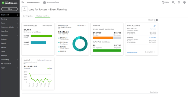
Your QuickBooks Online will likely now open to this screen.
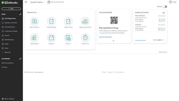
The first thing I do is change to the Business Overview. I find this much more useful.
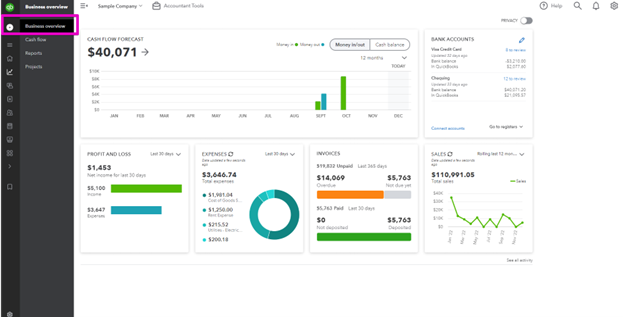
This is where you will now find reports and projects. Get paid and pay is where you will now find all of the pages related to your customers and suppliers or vendors.
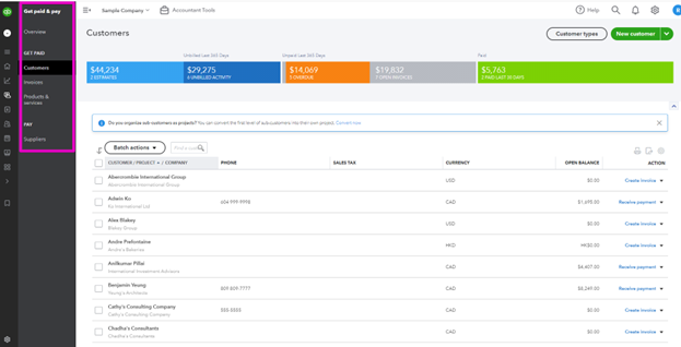
Customers and leads is another place to find your customers, and the new Marketing tab connects to Mailchimp.

I would love to hear if you are using this new integration, and if it is helping you to grow your business and batter manage communications with your customers.
Payroll and Taxes remain unchanged – thank goodness!
Bookkeeping is now where you will find your bank feed – hidden away! The most important thing!
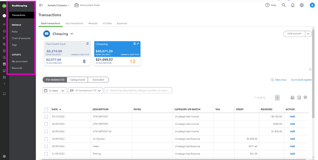
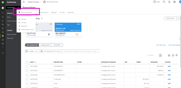
The Transactions tab will open the bank feed, and you will need to use the left hand bar to access your rules.
The Chart of Accounts and Tags are here also.
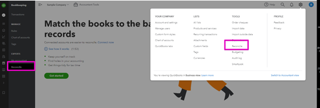
This is one of the places you can access the Reconcile function – it is still available from the top right gear icon.
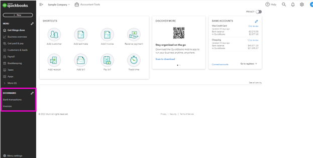
You can bookmark your favourite screens.
And you will have quick and easy access to those you use most often.
Now if you are like me, you are wondering why this change was necessary, and you just want your nice simple view back, you can have it!
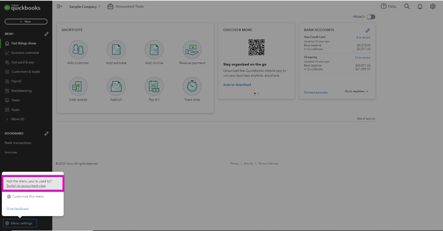
And voila! Everything looks normal again!
I would love to hear what you think about the new menu bar. Needless to say I am not a fan!
— Other Resources
Still need help?
Check this out.
Let's go!Still need help?
Book a session! We can work together to solve your specific QuickBooks Online questions.
Let's go!Video transcript:
Hi, Kerry here from My Cloud Bookkeeping. Today, I'm going to be talking about the new navigation menu and if you're thinking what on earth is the navigation menu, it's the black bar down the left-hand side of your QuickBooks screen where you're used to just popping in and very easily choosing the different places that you want to navigate to. Now, quite a while back in the US most QuickBooks files were changed to this new format and then recently in Canada it rolled out also and if you're in the UK you'll be seeing this version in the new year now. I've been trying to ignore it and just changing back to the view I'm used to but I thought it was about time for me to have a look at it. Now if you watch all the way to the end I'm going to show you through the new menu and then I'll show you how you can change back to that older view if you prefer it but given now that now it's been rolled out to most users I thought it was time I worked through how to use it and I thought I'd show you also now this is one of those things that I really don't understand why QuickBooks changed it so to me it was something that wasn't broken the other menu worked and it's just this whole other language that you're expected to learn and understand when when I think it was all just working fine before and I would love to know what you think here we are in the sample company and most of you will now be opening up to this View and I don't find this useful at all quite frankly uh everything that's here you can easily find in the new button up here and we'll get to this in a second the business overview I think is a lot more useful I like to have mine set up so I can see what income I've had for the last 30 days to keep on top of my monthly targets and I also like to be able to see my income for the last 12 months you can also click right through to your bank from here this is just another one of the schedules that is standard that you can choose to have move around or take out it's not what we're here to talk about today but I just wanted to kind of get you to this place as you're opening in so I for me it just kind of eases me into what's happening in my business before I start anything else but while we're sitting here on this business overview I just want to point out that reports are now hidden away in here so they're in this business overview section reports if you're using projects you'll notice that they're here too this cash flow page I haven't used it much if any of you are using this I would love to hear how you find it if there's anything useful in there it's not something that I found useful myself or been able to direct any clients to yet so anyway we're gonna go and we're going to have a look at what this new navigation mean menu looks like you with perhaps the idea that maybe it will work for you so uh We've looked under our business overview so now let's go to get paid and pay and here's where you go to find customers invoices products and services previously we had an option of having this on the navigation bar and across the top here now it's only on the left but I don't really think that makes a big difference it's all going to look the same once you get into those pages now you might notice that suppliers is down here also so previously we had sales and we had expenses I don't know how get paid and pay is that much easier I'm sure you were all totally capable of understanding what sales and expenses were but anyway this is the change that has happened uh now down here yours may see vendors typically I think the US Virgin says vendors and the Canadian version says suppliers it's the it's the same thing now if we pop back here there is also customers and leads now this brings up the customers section exactly as we were just looking at but it also has marketing here now this is most likely intended to be this connection with MailChimp you may recall I think I wrote a blog post on that earlier this year or was it last year Intuit purchased MailChimp so there'll probably be some cool features available here if you're also a MailChimp subscriber and this could be the subject of another video so if you are connected to MailChimp and this is something that you're looking at by all means reach out and let me know how you're finding it I would love to hear so pop back over to here we get to payroll which is self-explanatory not a problem there and then we come down to bookkeeping now this is where your bank feed is hidden away personally I would just prefer the bank feed to be a lot easier to find previously we had either banking or transactions but you I've had clients Reach Out freaking out because they just actually cannot find the bank feed here it is now do keep in mind also that from either the getting things done page or the business overview page if we go back to the business overview you can click through to the bank accounts here so you can see here in our checking we have 12 to review if we click here it does open up this Bank feed so there as before there are still multiple ways to get to the same place so we'll pop back to bookkeeping now here we are and see what options we do have so this is our transactions the bank feed us we're accustomed to seeing now rules are no longer here across the top they're here and your chart of accounts is accessed from here as well um because this one hasn't been opened before we have that extra bit and tags if you're using tags once again this is something only a few of my clients have been using and they've been using it quite successfully it's it gives you just an extra um dimension on your reporting so once again if that's of interest to you do reach out I'm not going to dive into it right here.
now further down here we can see experts and my accountant and if you have an accountant on your QuickBooks Online file this is where you can very easily share documents obviously that's not showing up here in the sample company and then reconcile is here also gosh that thing pops in and out quickly doesn't it you can still find it from the top right gear icon if that's your preferred route so if you pop up to here and reconcile it's still exactly here so thankfully that's not completely changed the other way to find it is from your bank register so if you're in your transactions here and you pop into your bank register you still have the option to reconcile from here so while this menu down the left hand side has changed a lot a lot of the other routes to these different areas are here as well.
taxes thankfully has not been changed around you can still access sales taxes for any jurisdictions where you're registered apps is where you'll see any apps you have connected to your QuickBooks Online file and of course being a sample company there are no apps here just a bunch of suggestions I do use some of these um I use rbbc pay and sync I use Dex prepare if you're in the US you'll be seeing a lot of different options of course but yeah some of these are fantastic if you ever need any help making connections or understanding what might be the best app for you just do reach out so let's have another look on the left hand side here you can see there are bookmarks and I have Bank transactions here because as I've mentioned it's kind of the place you need to start once you've had a look at what's going on you want to pop in here I kind of Geekly do this on a daily basis but if you're in there at least weekly that's fantastic and I can show you how to create a bookmark for anything else that is important to you.
if we pop up to say let's get paid and pay and maybe invoicing would be something that you would want to have bookmarked because it's something you want to be able to see very easily bang here it is and invoices and it opens up that customer section you do have the option to bookmark things you use often because now of course they're just all hidden away in here I don't know why I dislike this so much I just really do and I'm obviously not the first the only person to think this because if we pop down to the menu settings here you can see we can switch to the accountant View oh and this is always such a relief to me it's one of the first things that I do when I start working with a client because this is what I'm used to seeing their new format is going to work for you better and you want to pop back to it you switch to the business View and you can get used to it maybe it makes more sense to you and you can create your bookmarks but if not you know how to change it to the accountant View and I would love to hear which one you prefer well if you're still with me and you haven't just rushed to change to the accountant View and get rid of that business view I'd love to hear from you does this actually make your life easier I can see perhaps the bookmarks would other than that I don't think so but I would love to hear from you also if there's anything else you'd like to look at let me know I mentioned a few things in the video there were tags uh some other features that I haven't yet made a video on so I'd love to hear if there's something you'd find useful or something you'd like to know more about comment down below and as always be sure to like subscribe and I'll see you again soon.
Cheers.
Video transcript:
Hi, Kerry here from My Cloud Bookkeeping. Today, I'm going to be talking about the new navigation menu and if you're thinking what on earth is the navigation menu, it's the black bar down the left-hand side of your QuickBooks screen where you're used to just popping in and very easily choosing the different places that you want to navigate to. Now, quite a while back in the US most QuickBooks files were changed to this new format and then recently in Canada it rolled out also and if you're in the UK you'll be seeing this version in the new year now. I've been trying to ignore it and just changing back to the view I'm used to but I thought it was about time for me to have a look at it. Now if you watch all the way to the end I'm going to show you through the new menu and then I'll show you how you can change back to that older view if you prefer it but given now that now it's been rolled out to most users I thought it was time I worked through how to use it and I thought I'd show you also now this is one of those things that I really don't understand why QuickBooks changed it so to me it was something that wasn't broken the other menu worked and it's just this whole other language that you're expected to learn and understand when when I think it was all just working fine before and I would love to know what you think here we are in the sample company and most of you will now be opening up to this View and I don't find this useful at all quite frankly uh everything that's here you can easily find in the new button up here and we'll get to this in a second the business overview I think is a lot more useful I like to have mine set up so I can see what income I've had for the last 30 days to keep on top of my monthly targets and I also like to be able to see my income for the last 12 months you can also click right through to your bank from here this is just another one of the schedules that is standard that you can choose to have move around or take out it's not what we're here to talk about today but I just wanted to kind of get you to this place as you're opening in so I for me it just kind of eases me into what's happening in my business before I start anything else but while we're sitting here on this business overview I just want to point out that reports are now hidden away in here so they're in this business overview section reports if you're using projects you'll notice that they're here too this cash flow page I haven't used it much if any of you are using this I would love to hear how you find it if there's anything useful in there it's not something that I found useful myself or been able to direct any clients to yet so anyway we're gonna go and we're going to have a look at what this new navigation mean menu looks like you with perhaps the idea that maybe it will work for you so uh We've looked under our business overview so now let's go to get paid and pay and here's where you go to find customers invoices products and services previously we had an option of having this on the navigation bar and across the top here now it's only on the left but I don't really think that makes a big difference it's all going to look the same once you get into those pages now you might notice that suppliers is down here also so previously we had sales and we had expenses I don't know how get paid and pay is that much easier I'm sure you were all totally capable of understanding what sales and expenses were but anyway this is the change that has happened uh now down here yours may see vendors typically I think the US Virgin says vendors and the Canadian version says suppliers it's the it's the same thing now if we pop back here there is also customers and leads now this brings up the customers section exactly as we were just looking at but it also has marketing here now this is most likely intended to be this connection with MailChimp you may recall I think I wrote a blog post on that earlier this year or was it last year Intuit purchased MailChimp so there'll probably be some cool features available here if you're also a MailChimp subscriber and this could be the subject of another video so if you are connected to MailChimp and this is something that you're looking at by all means reach out and let me know how you're finding it I would love to hear so pop back over to here we get to payroll which is self-explanatory not a problem there and then we come down to bookkeeping now this is where your bank feed is hidden away personally I would just prefer the bank feed to be a lot easier to find previously we had either banking or transactions but you I've had clients Reach Out freaking out because they just actually cannot find the bank feed here it is now do keep in mind also that from either the getting things done page or the business overview page if we go back to the business overview you can click through to the bank accounts here so you can see here in our checking we have 12 to review if we click here it does open up this Bank feed so there as before there are still multiple ways to get to the same place so we'll pop back to bookkeeping now here we are and see what options we do have so this is our transactions the bank feed us we're accustomed to seeing now rules are no longer here across the top they're here and your chart of accounts is accessed from here as well um because this one hasn't been opened before we have that extra bit and tags if you're using tags once again this is something only a few of my clients have been using and they've been using it quite successfully it's it gives you just an extra um dimension on your reporting so once again if that's of interest to you do reach out I'm not going to dive into it right here.
now further down here we can see experts and my accountant and if you have an accountant on your QuickBooks Online file this is where you can very easily share documents obviously that's not showing up here in the sample company and then reconcile is here also gosh that thing pops in and out quickly doesn't it you can still find it from the top right gear icon if that's your preferred route so if you pop up to here and reconcile it's still exactly here so thankfully that's not completely changed the other way to find it is from your bank register so if you're in your transactions here and you pop into your bank register you still have the option to reconcile from here so while this menu down the left hand side has changed a lot a lot of the other routes to these different areas are here as well.
taxes thankfully has not been changed around you can still access sales taxes for any jurisdictions where you're registered apps is where you'll see any apps you have connected to your QuickBooks Online file and of course being a sample company there are no apps here just a bunch of suggestions I do use some of these um I use rbbc pay and sync I use Dex prepare if you're in the US you'll be seeing a lot of different options of course but yeah some of these are fantastic if you ever need any help making connections or understanding what might be the best app for you just do reach out so let's have another look on the left hand side here you can see there are bookmarks and I have Bank transactions here because as I've mentioned it's kind of the place you need to start once you've had a look at what's going on you want to pop in here I kind of Geekly do this on a daily basis but if you're in there at least weekly that's fantastic and I can show you how to create a bookmark for anything else that is important to you.
if we pop up to say let's get paid and pay and maybe invoicing would be something that you would want to have bookmarked because it's something you want to be able to see very easily bang here it is and invoices and it opens up that customer section you do have the option to bookmark things you use often because now of course they're just all hidden away in here I don't know why I dislike this so much I just really do and I'm obviously not the first the only person to think this because if we pop down to the menu settings here you can see we can switch to the accountant View oh and this is always such a relief to me it's one of the first things that I do when I start working with a client because this is what I'm used to seeing their new format is going to work for you better and you want to pop back to it you switch to the business View and you can get used to it maybe it makes more sense to you and you can create your bookmarks but if not you know how to change it to the accountant View and I would love to hear which one you prefer well if you're still with me and you haven't just rushed to change to the accountant View and get rid of that business view I'd love to hear from you does this actually make your life easier I can see perhaps the bookmarks would other than that I don't think so but I would love to hear from you also if there's anything else you'd like to look at let me know I mentioned a few things in the video there were tags uh some other features that I haven't yet made a video on so I'd love to hear if there's something you'd find useful or something you'd like to know more about comment down below and as always be sure to like subscribe and I'll see you again soon.
Cheers.
Still need help?
Check this out.
Let's go!Still need help?
We have what you need. Check out our courses and free resources to get more help managing your finances.
Let's go!.png)